Well-known for their out-of-the-box magazine covers, it only made sense to see what PUBLISHER would come up with when using Pergraphica as their canvas. The results were striking, bold, and better than we could have dreamed up.
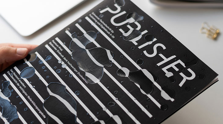
We provided two of our most iconic paper shades, Infinite Black and Imperial Red, for two separate editions of the magazine (5-20 and 3-21) and we honestly can’t pick a favourite. The unique and challenging cover designs by Swiss graphic designer Erich Brechbühl meant that the printing teams at Howigra AG and Sonderegger AG respectively, had their work cut out for them. The production processes involved many special finishes and outstanding craftsmanship to deliver two uniquely stunning covers that stand the test of time.
Above all, both these covers perfectly showcase the value of printed products; that they evoke such a multisensory experience when picked up that you don't want to put them down.
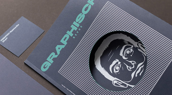
Screen printing is especially suitable for achieving opaque ink layers that cover the colour of the paper, making it optimal for printing white on black — something which is challenging with other technologies. Premium printer Howigra AG, is considered a specialist for this process in Switzerland.
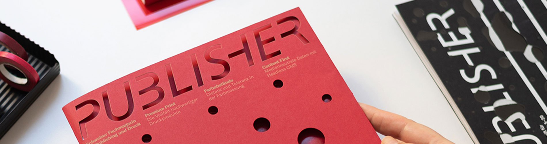
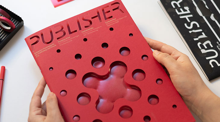
The fold-out cover demonstrates various technically challenging finishing methods, which come together seamlessly. The principle design is die-cut, the title laser-cut and the issue details are laser engraved, adding a unique touch and a legible contrast thanks to the change in colour from the engraving process.
Last, but certainly not least, the motif on the interior fold-in has been embossed, and thus appears through the die-cut on the front of the folded cover. A clear hot foil, Clarity Light from Foilco, was applied over the embossing, lending a transparent layer with a slight tint that makes the embossed motif more vivid and tangible.